Sparklines
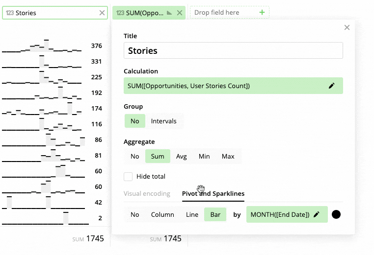
If your pivot calculation is a Date, then it can be desirable to see the historical dynamic of the values by month, week or year. That’s why you can visualize numbers as a line or bars instead of a column.
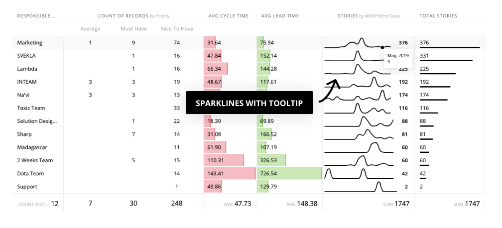
For instance, you can see the productivity pattern of the team by splitting stories by End Date. The tooltip shows separate values.
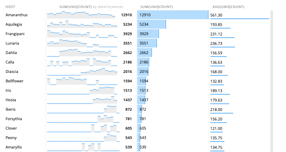
Or you can explore the feature usage by customers.
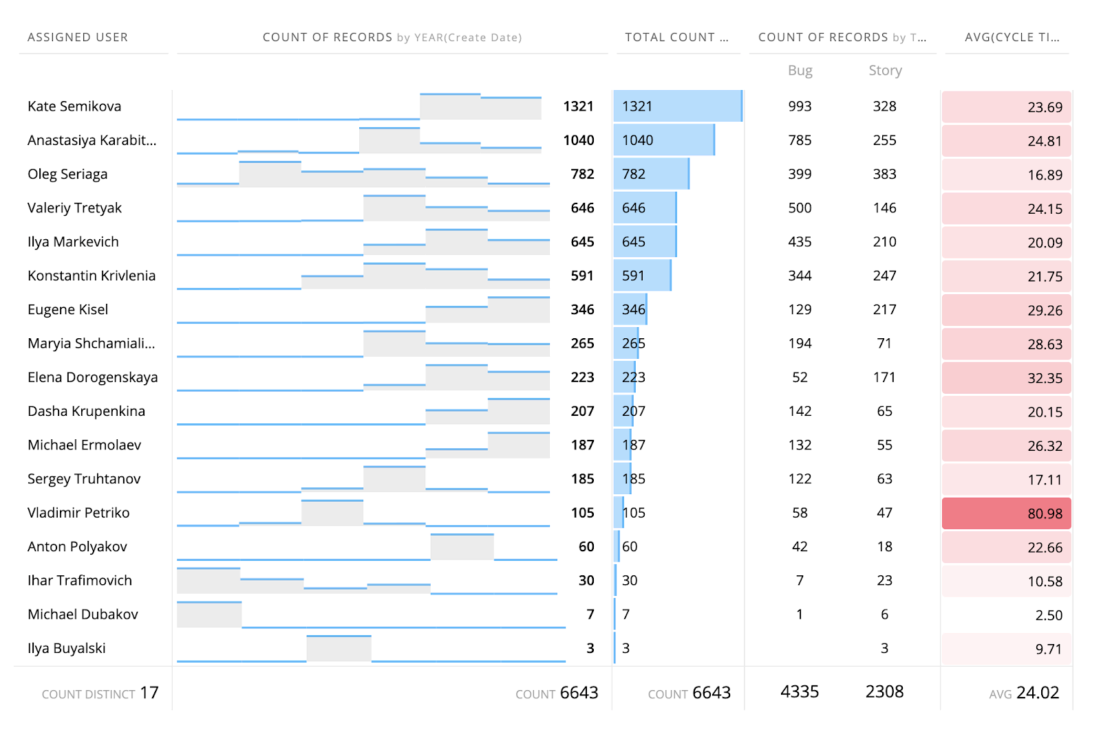
Or developers performance during years.