Pie Charts
A pie chart (or a circle chart) is a circular statistical graphic, which is divided into slices to illustrate numerical proportion.
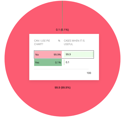
Statisticians generally regard pie charts as a poor method of displaying information, and they are uncommon in scientific literature. One reason is that it is more difficult for comparisons to be made between the size of items in a chart when area is used instead of length and when different items are shown as different shapes.
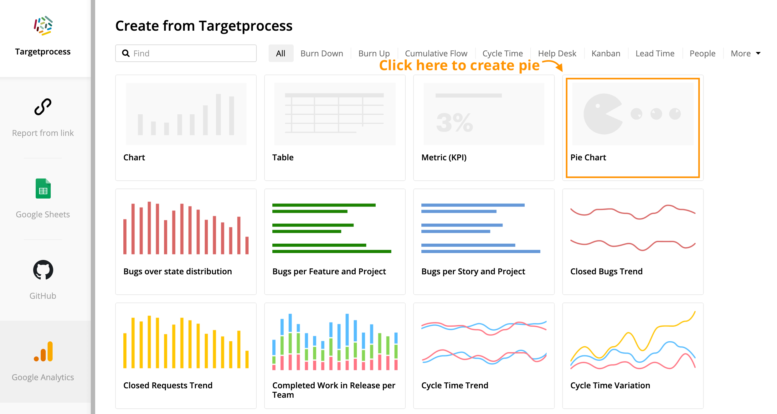
Create new pie chart
The way you can create the pie chart is similar to creation of charts or tables.
- Proceed with creation of a new report for desired sources
Click on Pie Chart
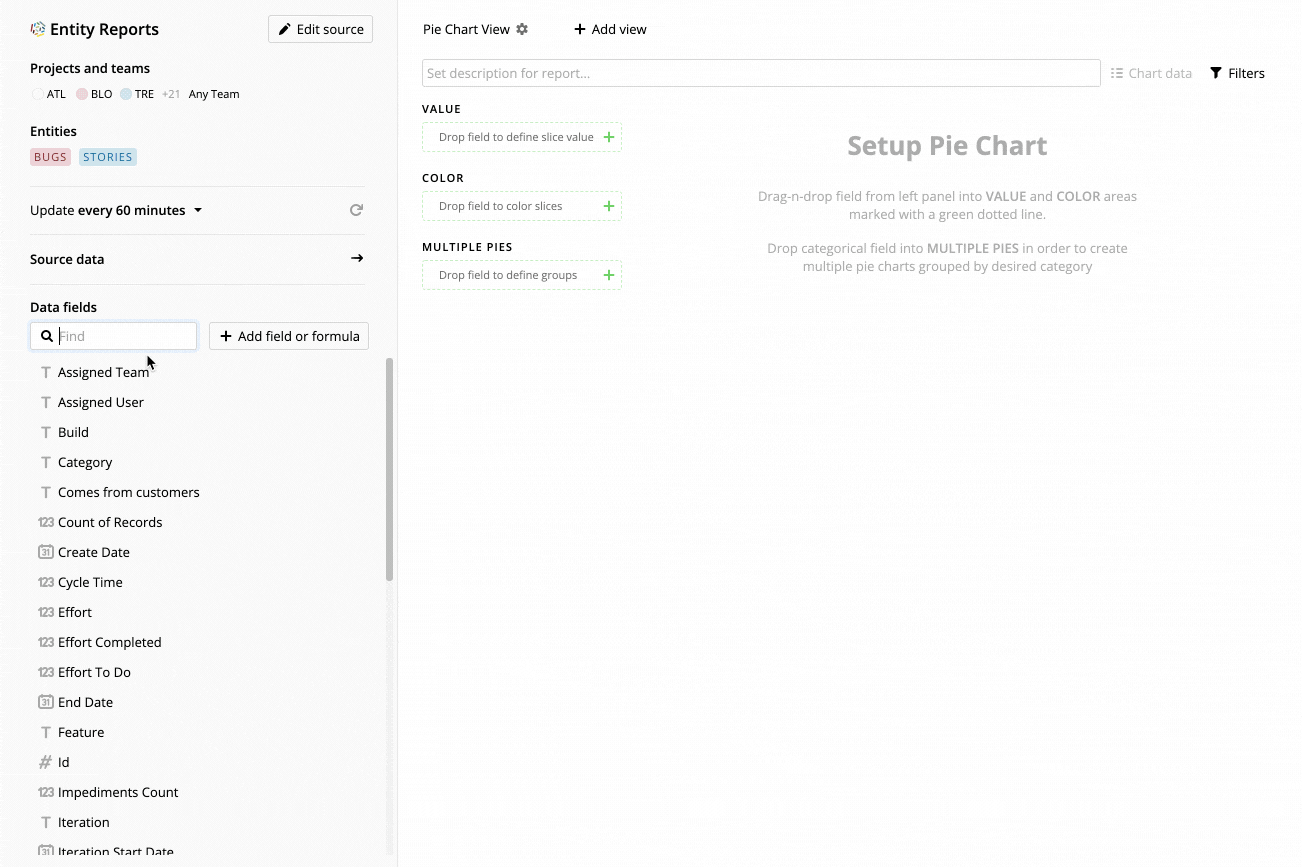
Drop desired fields into value and color. Drop categorical field into multiple pies if there is a need to compare several pies over desired category as Edward Tufte said: "Pie charts are bad and that the only thing worse than one pie chart is lots of them."
You can also add pie charts to existing reports by creating additional view.