Chart Editor
Anatomy & Terminology
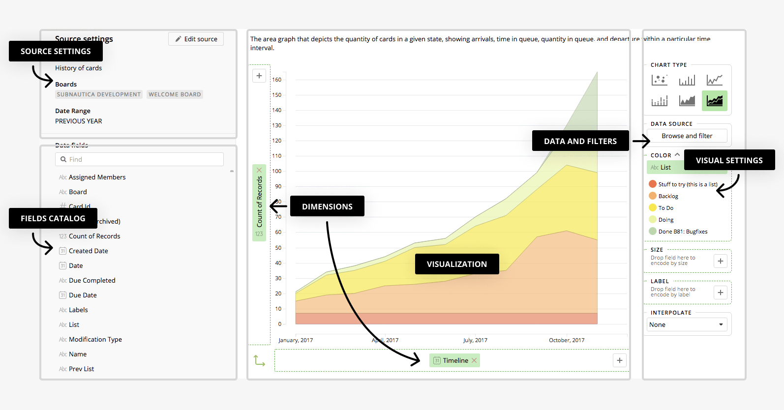
You can find an explanation of basic elements in the chart editor via the image below:
Source Settings
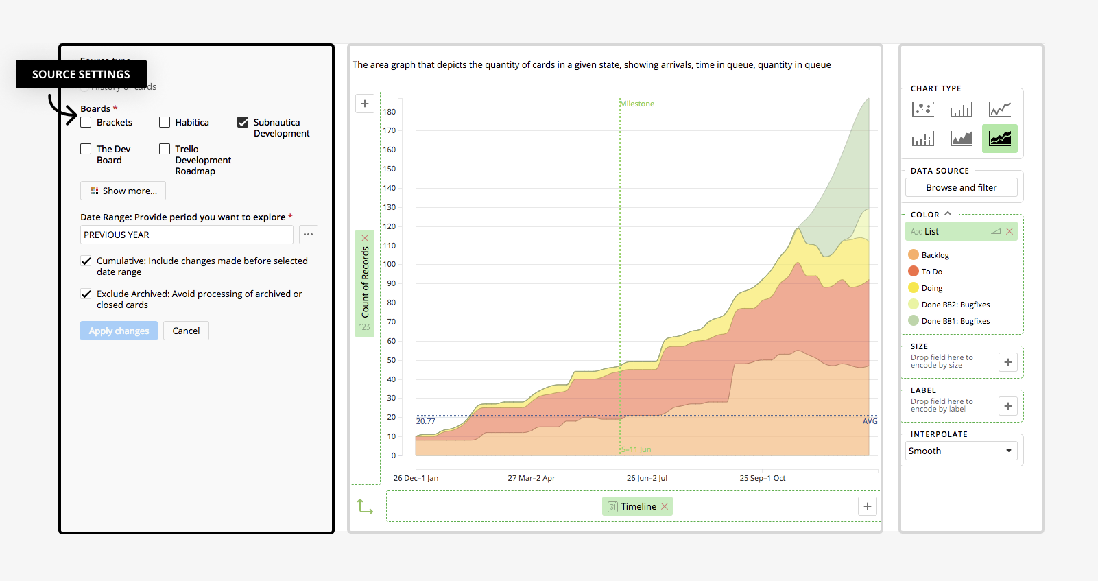
Source settings shows the configuration of chart data source. Can be changed by pressing Edit Data Source button. Please note source type can be changed only for new report. For example, we have created two source types for Trello: Cards and History of cards. Cards source is consists of current or archived board cards and considered to be used when you suppose to visualize data related to current state of board, for example cards distribution of lists. History of cards consists of transitions between lists. Every raw in datasets of this type is a historical action related to moving card from one list to another. It's considered to be used for visualizing list changes of cards during time in history, for example cumulative, durations or transitions reports.
Fields Catalog
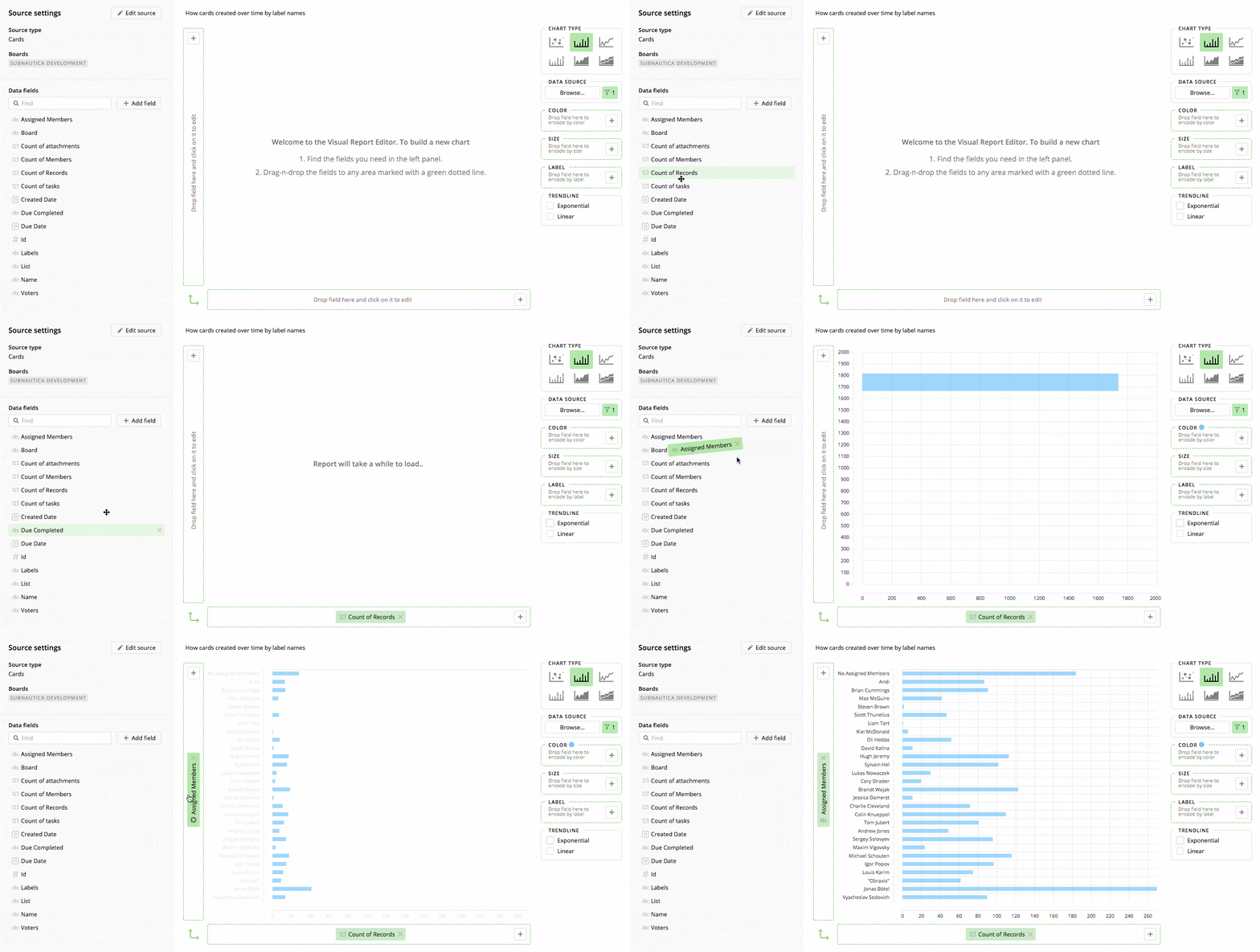
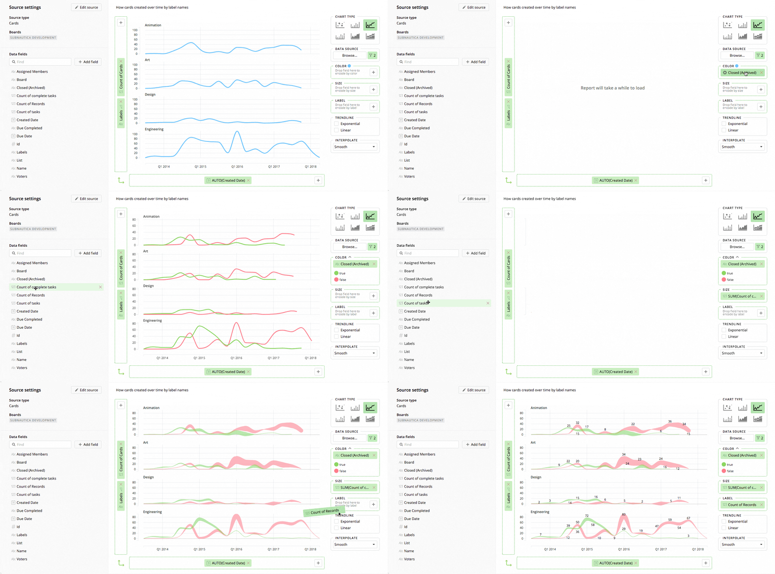
Fields catalog contains all fields available for report datasource. Use drag and drop to put field into destination axis or double click on field and system will put the field into some suitable axis automatically. Description can be explored by putting mouse over interested field. Fields can be hidden from catalog by clicking red cross which is appeared on mouse over and can be visible again by using Add Field button.
Name & Description
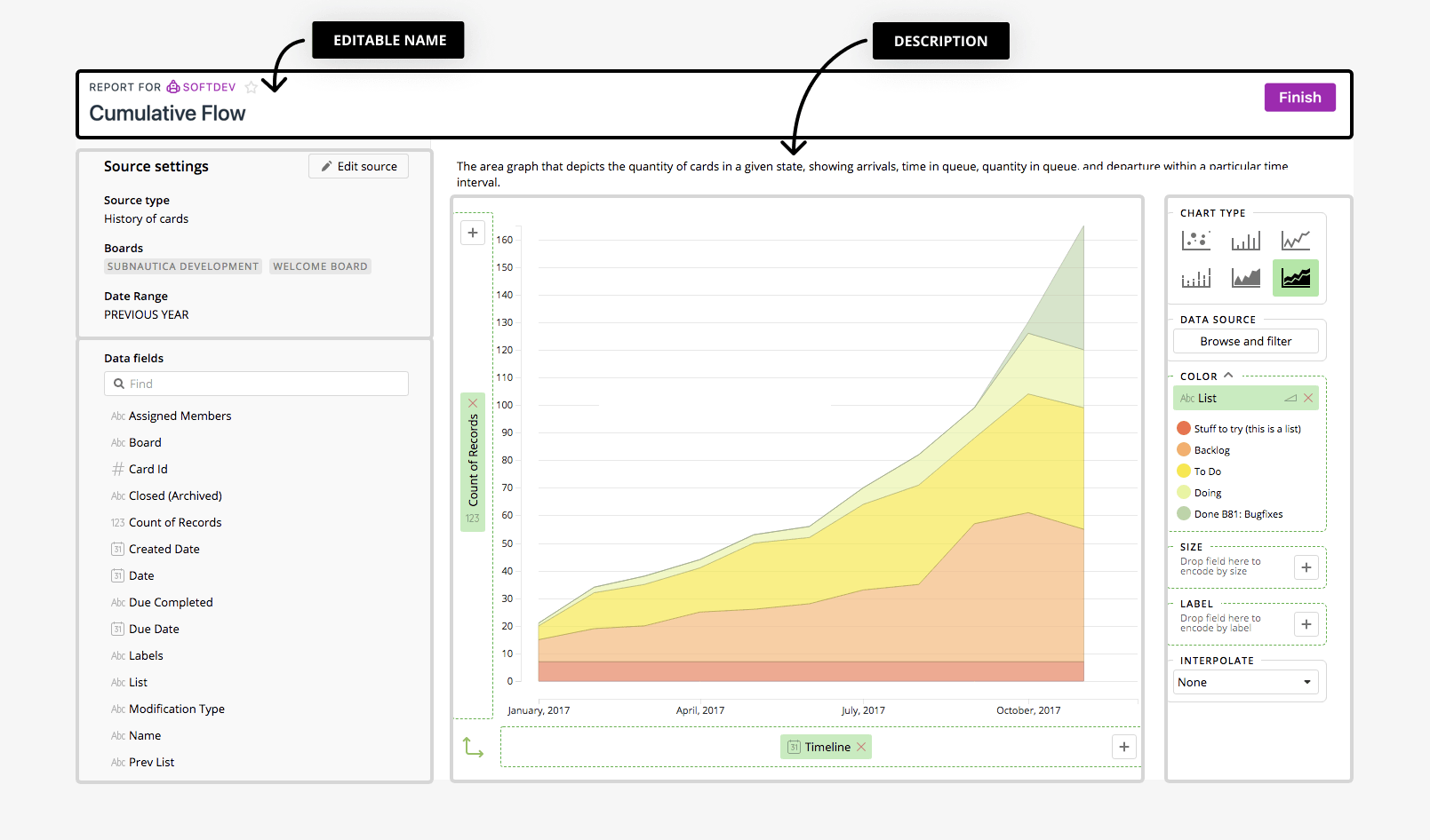
You can change the name and the explanation of the chart by providing values in name and description text boxes.
Dimensions
The data field which is put into any axis or color, size and label panels using drag and drop becomes dimension. You can create dimension for axis or color and other panels by using axis "+" button using creating new calculation popup.
Dimension popup contains calculation of the dimension, link to chart filters, group buttons or aggregation options which should be applied to calculation. Click in calculation text box will lead to calculation popup so you can edit to create complex calculation which can not be handled by UI of the system.
here are some visual settings like axis title or annotations. Annotation line can be added by pressing Add new button under Annotation Lines section. Scale for dates can be switched to periodic rendering.
Chart Type
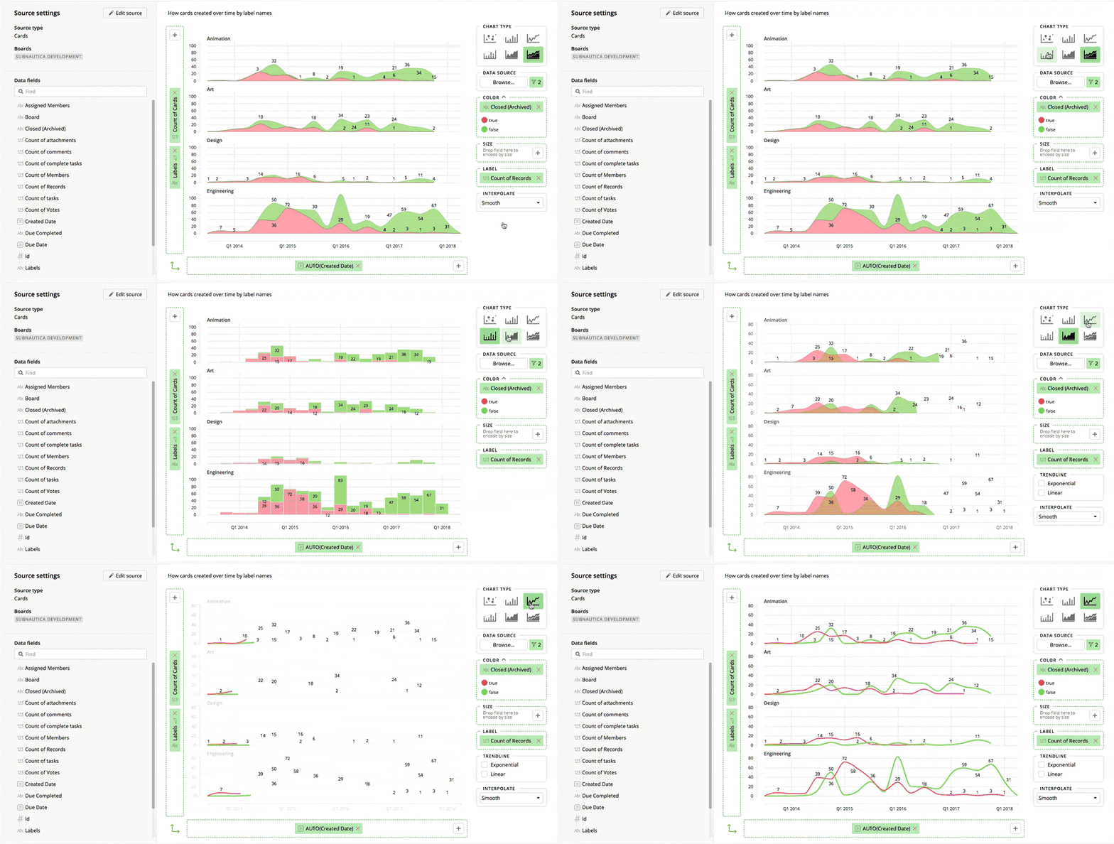
We support six types of graphical representation of data: Scatterplot, Bar, Stacked Bar, Area, Stacked Area and Lines. Click on chart type icons to find desired one.
Data Source Panel & Filters
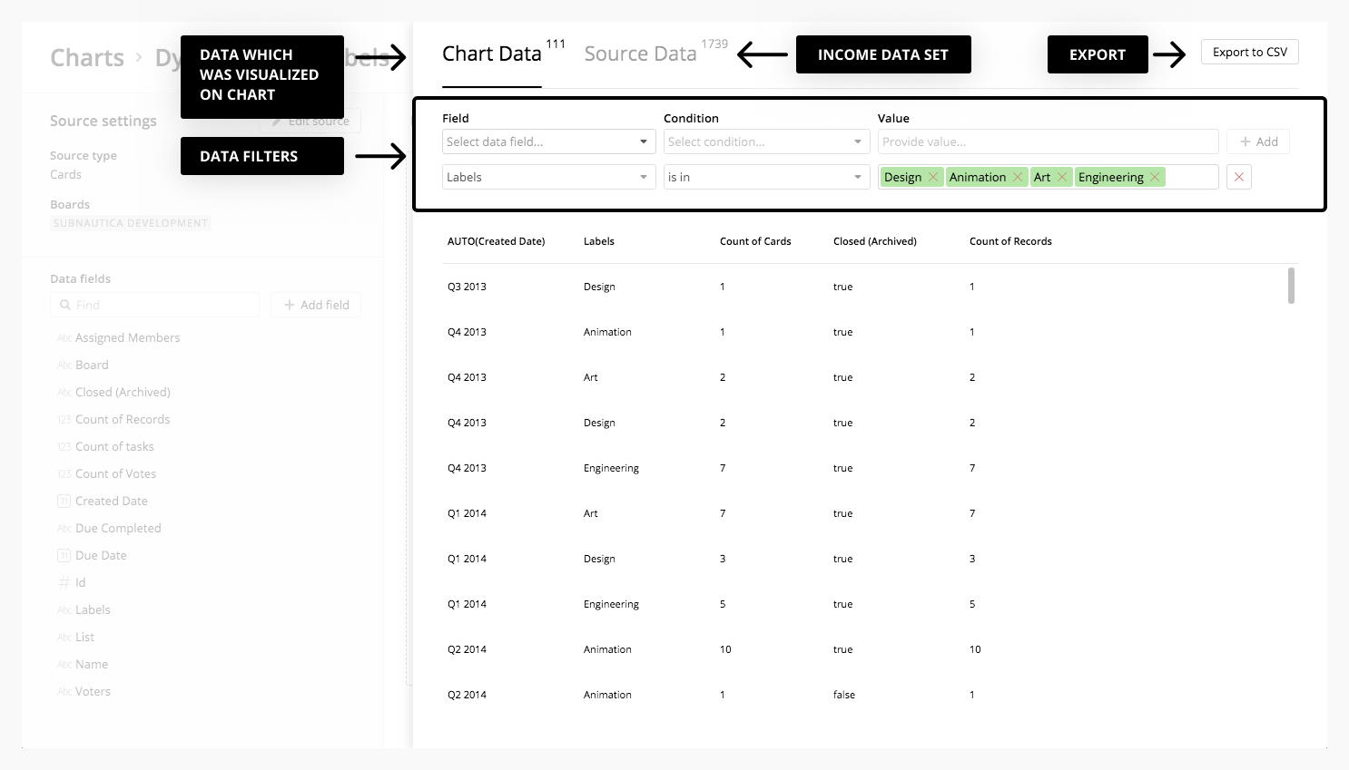
Income data can be browsed and filtered by using data panel and filters. Click on Browse button and you will see data panel consists of two tabs. Chart Data contains aggregated and calculated data on chart and Source Data shows raw income data set.
Data paned contains Export To CSV button and filter controls which allow to exclude non-required values or focus on some specific subset of data.
Color, Size & Label Panels
Drop fields into Color and Size panels when you need to encode your chart elements by color or size.
Create calculation or drop field into Label Panel when it is required to split dataset by groups and sign them with categorical values.
Trendline and Interpolation
It is almost always interesting to know the general trend of a variable. Trendline panel contains options: Linear and Exponential.
Interpolation can be used for making elements smoother or turned into steps (can be applied for area and line types). You can change places of X and Y dimensions by pressing Reverse Axis button.
