Tabular reports
Sometimes it is very useful to show aggregated data using tabular reports. If you combine tabular and chart representations you can compare a lot of key metrics in one place and get a dense information report.
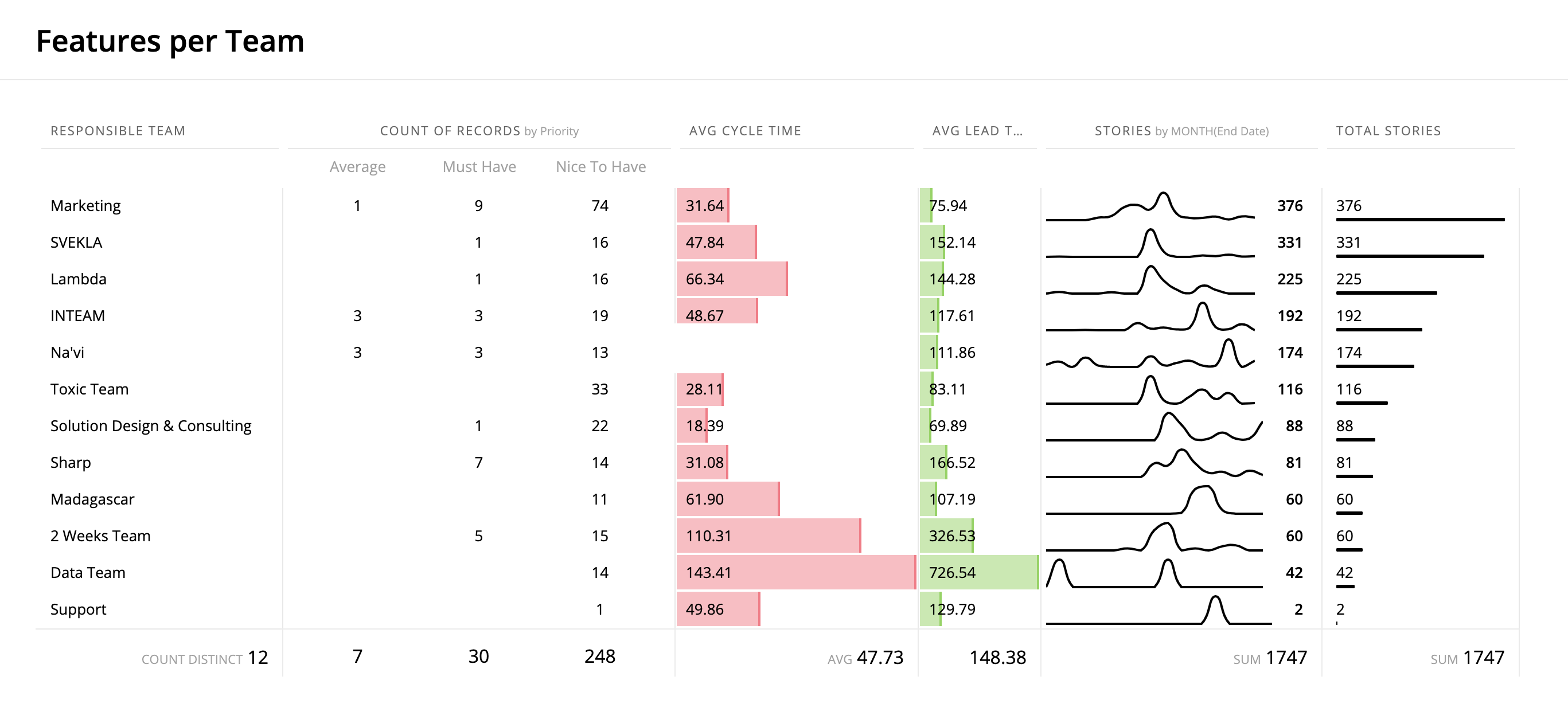
When compared to a chart, a table can contain more information because of its information density. Scrolling and resizing makes it more efficient in limited spaces, so experiment with charts and tables to get the best result for the dashboard.